In 2017 the world is awash in data and statistics; polls and surveys, censuses and economic data, trending topics and web analytics are just the start. As the internet of things enters our lives, the amount of available data will grow exponentially.
With all of that data at our disposal, it is natural and appropriate that data is included in and even drives many news stories. However, it is not difficult to misinterpret statistics to draw false conclusions. Most of the time this is done accidentally, but it can also be done deliberately to distort reality and make points not supported by data. After all, if politicians or journalists include charts and graphs in a presentation, few readers will double check the numbers or the logic.
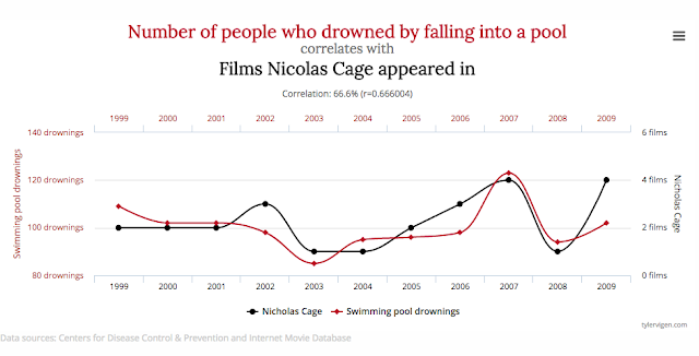
 Chart via Spurious Correlations
At the Conversation, Winnifred Louis and Cassandra Chapman, social psychologists from the University of Queensland, have posted an article titled “The seven deadly sins of statistical misinterpretation, and how to avoid them”.
“Statistics is a useful tool for understanding the patterns in the world around us. But our intuition often lets us down when it comes to interpreting those patterns. In this series we look at some of the common mistakes we make and how to avoid them when thinking about statistics, probability and risk.”
If you’re a reporter or communicator who uses statistics, or just want to be a better informed consumer of media, give it a read.